Attending the Urban Sketcher's Symposium in Chicago last month was so inspiring! I learned so much from the other sketchers I met and, of course, from the instructors of my workshops. Now, that I've been home - I decided to revisit each of the workshops I took (with Marc Taro Holmes , LK Bing, Marion Rivolier, and Liz Steel) and the demonstration I attended (with Stephanie Bower) to remember what I was taught and practice!
Today, I am revisiting Marion Rivolier's How to Reach the Sky workshop, which I took on Friday afternoon of the Symposium. I have been following Marion on Instagram for a while now and have always admired her watercolors and urban sketches. I love her use of watercolors without a preliminary drawing, the colors she uses, and the landscape format she so often uses - so, I was very excited for the chance to learn from her in this workshop.
Marion started out the workshop explaining that she wanted to show us the intimate relationship between the sky, the lights, the movement of the clouds, the buildings and the architecture, which are revealed by the sky. She said that we will observe how the sky reveals the colors of the city. First, however, she wanted to check our materials - our sketchbooks and our watercolors as we will be painting in watercolors directly for this workshop without any preliminary underdrawing.
Marion had us practice mixing dark colors in various warm and cool mixtures. Here are my dark mixtures using Daniel Smith's Ultramarine Blue and Transparent Pyrrol Orange; Ultramarine Blue and Pyrrol Crimson; and Indanthrone Blue and Pyrrol Crimson - with varying amounts of each color. Marion reviewed our colors to make sure we could make sufficiently dark colors. She recommended that we make color charts of our watercolors to understand what colors are possible with our sets.
Dark color mixtures
Next, we took the Chicago skyline, our subject, and focused on the sky alone in sketching the sky or negative space around the buildings in a single, dark color. Marion warned us at the outset of the workshop that we may not create any "pretty" pieces of art today as we are going to be more concerned about experimenting and learning today.
using a single cool, dark color to paint the sky / the negative shapes of the buildings
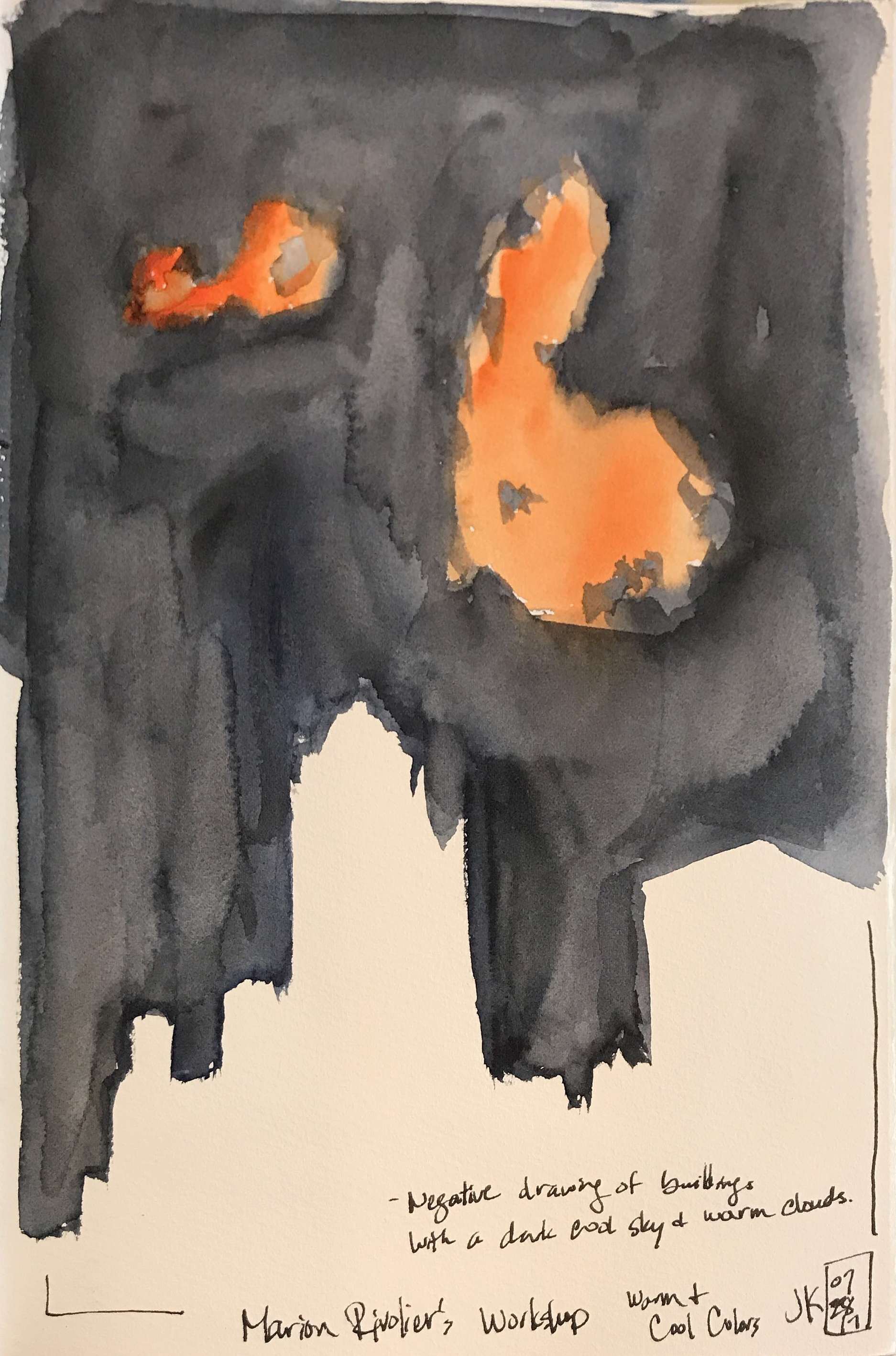
Next, we played with warm and cool values as Marion says that warm and cool values are the key to understanding volume as they allow us to create contrasts that accentuate depth and volumel. We were to choose a dark cool color and add in a warm color for clouds (which we had to invent as the sky was clear at that moment).
negative drawing with a dark, cool sky and warm clouds
Next, we painted the negative shapes of the buildings to indicate the sky and added a warm color for highlights on the buildings and a cool light color for reflections of the sky on the buildings.
warm highlights and cool sky reflections on the buildings
In our next exercise, we ignored the sky and just used a warm color to indicate highlights on the buildings and a cool light cool to indicate reflections of the sky on the buildings.
warm highlights and cool sky reflections on the buildings
Next, we took this exercise one step further and added cool and warm dark colors to indicate warm and cool shadows on the buildings after indicating the warm highlights and cool sky reflections on the buildings.
combining warm highlights, cool sky reflections on the buildings with cool and warm dark shadows
the workshop's efforts
In the end, we combined all of these concepts into a final sketch (that I admittedly ran out of time to complete.
Final sketch utilizing all of the concepts from Marion's workshop
Final sketches of the workshop
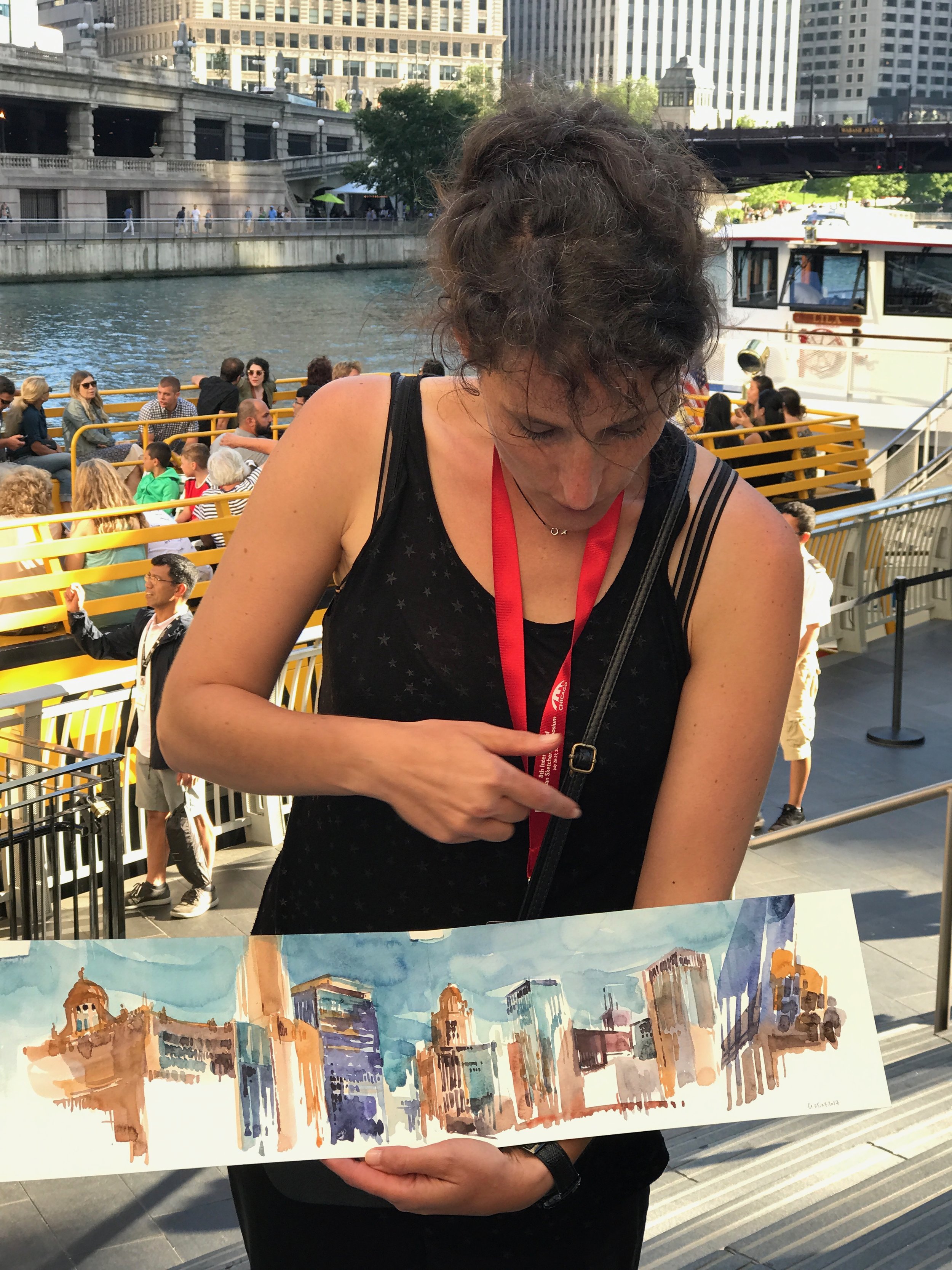
Marion showing us her sketch utilizing the concepts she taught us
In summary, I found the concepts of warm and cool color contrasts to be a bit hard to get my head around. In theory, I understand the concept, but it's a whole other matter in practice! I don't think I've trained my eyes enough to see and differentiate between cool and dark shadows, etc. Also, in the beginning of the workshop, Marion kept asking us to give more room for the sky in our composition. I think this tip will be the easiest for me me to implement right away, but I will keep working on trying to see and utilize warm and cool value contrasts.
Today, prior to the partial solar eclipse that turned out not to be viewable where I was in Berkeley, I tried to keep Marion's workshop in mind and sketched the sky with a bit of my view from the Claremont Resort Hotel.
My sketching set up today
trying to reach our overcast sky today
As a side note - I love Marion's use of rich watercolors and coveted her Indigo Blue that she demonstrated in the workshop to make a cool, dark color - so I asked her what brand of watercolors she uses. She said that she uses White Nights watercolors primarily because they are fairly cheap (about 2 euros for a half pan) and she goes through a lot of watercolors. I love my Daniel Smith watercolors, but I was tempted to try Marion's watercolors and bought some White Nights watercolors on Amazon. I've been using them since them and enjoy having a limited palette of warm and cool colors with a couple of convenience colors added in. Here is Marion's palette - which I have some of the colors - but not all of them based on my own preferences.
Marion's White Nights palette
In conclusion, I have much to learn and practice from Marion's workshop still. But, I have resolved to view her own work on Instagram with a more knowledgeable eye based on the concepts she explained to us.
Thanks for reading this! Stay tuned for my blog posts on Liz Steel's workshop and Stephanie Bower's demonstration.


